Typography is much more than a decorative consideration. The typeface we use across our websites, apps, and other digital products significantly impacts how users engage with content, process information, and form their final impression of the brand. Although most designers devote much attention to color schemes, layout, and images, typography is one of the most effective and most effective yet often overlooked tools to influence the user experience and engagement.
The Psychology of Typography
Each font carries psychological meaning. Typefaces such as Times New Roman or Garamond are serif fonts associated with tradition, trust, and formality. They evoke printed newspapers and traditional publishing, so they are the best options for law firms, financial institutions, or publications that need to take command. Fonts such as Helvetica, Arial, or Open Sans are modern, clean, and approachable. Tech firms and startups are drawn to such typefaces due to their message of innovation and accessibility
Script fonts convey elegance and personalization, but they should be used carefully. They are not ideal for small text and can reduce readability when overused. Display fonts are bold statements, but in many cases, they are not very readable and create a visual effect. Knowledge of such psychological associations enables designers to align typography with brand identity and user expectations, creating an emotional response before a single word is read.
Readability: The Building Block of Engagement
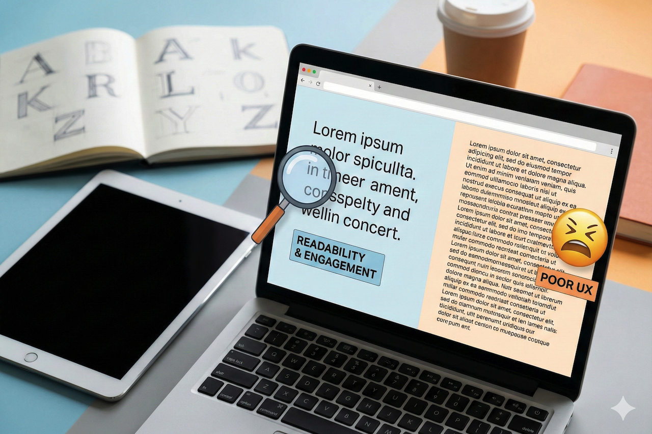
Regardless of how attractive a font is, if customers cannot read it, their interest will be minimal. The readability is determined by several interacting factors: font size, line height (leading), letter spacing (tracking), and text-background contrast. Studies consistently indicate that a body text size of 16-18 pixels is optimal on the web, yet many sites still use 12- or 14-pixel fonts, which strain the eye.
Line height is also a critical element. Overly dense text and tight spacing are hard to scan, and excessively wide spacing between words disrupts the reading process. The golden ratio for line height is between 1.4 and 1.6 times the font size; however, this varies based on line length and font properties.
Take the case of reading a dense paragraph of text in 12-point Arial with narrow line spacing and the same text in 18-point Open Sans with much breathing space. The latter is inviting to be read, whereas the former is a working one. This difference is even more pronounced on mobile platforms, where real estate is limited, and reading conditions vary widely.
Typography in the Mobile Era
Typography is a major consideration that was radically changed by mobile devices. Something gorgeous on a 27-inch desktop screen fails miserably on a 6-inch smartphone screen. Touch targets should be large enough for fingers, not too small for a mouse cursor. Reading distance changes when users hold devices at arm’s length. Conditions of outdoor lights may make the font weights imperceptible.
Responsive typography is not just about adjusting font sizes at breakpoints. It involves reconsidering the hierarchy, adjusting line lengths to avoid awkward wrapping, and choosing typefaces optimized for small-screen displays. Web font services like Google Fonts have begun reporting metrics directly tied to mobile performance, recognizing that font file size affects page load time and user patience.
Typography and Information Architecture
Typography creates visual hierarchy to guide users through content. All these elements serve different purposes and should be styled accordingly: headers, subheaders, body text, captions, and calls to action. Having a well-constructed typographic hierarchy enables users to quickly scan the content, locate areas of interest, and determine where their reading energy should be expended.
The difference in hierarchical levels is significant. When headers are slightly larger or bolder than body text, users cannot perceive important structural information. On the contrary, when all the elements scream for attention with drastically different sizes or weights, the visual cacophony is overwhelming rather than leading. A good hierarchy provides a clear roadmap, using content rather than typographic noise.
Many effective websites limit themselves to two or three font weights and a well-thought-out range of sizes. This restraint ironically gives the designer greater creative freedom, since every typographic decision carries a distinct meaning. With the stress on everything, nothing is stressed. Hierarchy can be carefully designed so users instinctively know the content hierarchy.
Font Performance and User Patience
Custom fonts also have an invisible price tag: loading. Each font family, weight, and style contributes to page weight and rendering complexity. Even though the efficiency of modern web fonts has improved, poorly optimized fonts still cause annoying delays, especially for users with slower internet connections or older hardware.
Font loading strategies have evolved significantly. Font subsetting removes unnecessary characters to reduce file size. Display font properties control the time between page load and font availability in browsers. System fonts are already installed on user devices, which eliminates download time while still providing a professional appearance.
The fact that Google has embraced system fonts across most of its properties indicates that the performance aspect of typographic excellence is often compromised. Beautiful typography is irrelevant if users leave a site before the content is displayed because the custom font takes too long to load. The best user's font is usually the fastest.
Accessibility and Inclusive Design
Typography directly affects the accessibility of users with visual impairments, reading disabilities, or neurological conditions. Dyslexic users often have font-related issues, where letters such as b and d, or p and q, appear almost the same. Overly ornamental fonts block screen readers. A lack of contrast between text and background makes the content invisible to low-vision users or users with color blindness.
The Web Content Accessibility Guidelines set requirements for text sizing, contrast ratios, and responsive scaling. Adhering to these rules is not only a matter of legal compliance; it is also a matter of ensuring content reaches as many people as possible. The font used that is conscious of accessibility tends to improve readability for everyone, thus it is a rising tide lifting all boats.
Certain typefaces are designed with accessibility in mind. Fonts such as Atkinson Hyperlegible focus on character distinction and legibility rather than aesthetic novelty. These fonts may not have won design competitions, but they demonstrate that inclusive typography can be both functional and appealing.
Brand Identity Using Typography
Typography conveys brand personality effectively. Mailchimp's friendly, approachable typeface selections support its efforts to ensure email marketing is accessible to small businesses. The traditional serif masthead of the New York Times is a signal of journalistic authority and convention. The daring use of sans-serif typography on Spotify reflects its unconventional, lively music-streaming style.
Unity in typographic design in touchpoints strengthens brand awareness. When users see the same fonts across a web page, mobile application, email newsletter, and social media illustrations, they form unconscious associations between those typographic designs and the brand name. This consistency requires discipline and design systems that are detailed, specifying precise fonts, weights, sizes, and usage requirements.
The final brand typography expedition is custom fonts. Firms such as Airbnb, Netflix, and IBM have commissioned custom typefaces that provide a distinct visual identity and are optimized for their purposes. Although the development of custom fonts is an expensive venture (in terms of resources), the difference and brand equity can justify the cost to organizations operating large enough.
User Trust and Emotional Resonance
Typography affects emotions in subtle yet quantifiable ways. Professional typography is clean and it builds trust and credibility. Creative fonts are playful and approachable, and can erode expert perceptions in serious situations. The use of outdated or worn-out fonts, such as Comic Sans or Papyrus, can create a negative association that undermines the perceived quality of the content.
Research shows that typography is the sole factor that makes readers rate the same material differently. Articles that appear in readable, appealing fonts receive higher credibility ratings than the same articles that appear in less appealing fonts. This halo effect does not start and end with first impressions; it can influence decisions about sharing content, revisiting a site, or referring people to others.
The emotional effects of typography compound over time. Beautiful typography is often unnoticed, but poor typography is the first thing users notice. Bad spacing, typos, or amateur font choices create friction that builds throughout the user experience, slowly eroding goodwill and engagement.
Conclusion
Typography influences the user experience both evidentially and invisibly. It determines whether information is read, trusted, shared, or forgotten. Aesthetic and readable, performance and personality, creativity and accessibility, such typography is the best typography. It does not take up content but emphasizes it, helps users, does not disorient them, and strengthens brand awareness without disregarding user requirements.
With the digital experience constantly changing across devices, contexts, and users, the role of typography in interaction will become increasingly important. Designers who learn to control the interaction among font type choices, font size, spacing, hierarchy, and performance will deliver a user experience that not only looks stunning but is also useful. Thoughtful typography is no luxury in the attention economy, where every fraction of a second and pixel of the screen counts.
Disclaimer
The information provided in this article is for general informational and educational purposes only. While efforts are made to ensure accuracy, the content should not be considered professional, legal, or financial advice. Readers are encouraged to conduct their own research and evaluate tools, services, and strategies based on their individual needs.
This article may contain references or links to third-party websites and external resources. These links are provided for convenience and informational purposes only. IPLocation.net does not endorse, control, or guarantee the accuracy, relevance, or reliability of any external content. Webtrafficexchange.com is not liable for any damages, losses, or issues arising from the use of or reliance on external links or third-party services. Use of such resources is at your own risk.
Featured Image generated by Google Gemini.
Share this post
Leave a comment
All comments are moderated. Spammy and bot submitted comments are deleted. Please submit the comments that are helpful to others, and we'll approve your comments. A comment that includes outbound link will only be approved if the content is relevant to the topic, and has some value to our readers.
Comments (0)
No comment