People do not think about apps the way they once did. They no longer want an app for exploring. They open them because they need something done. Quickly. Quietly. Without resistance. That expectation shapes everything.
Hybrid apps sit in the middle of this reality. They are built once and live everywhere. They serve many devices, many habits, many moments of distraction. For a long time, they were treated as a technical compromise. Useful, but never ideal. That idea no longer holds.
By 2026, hybrid apps will not be judged by how close they feel to native. They will be judged by how little effort they demand from the user. UI and UX will carry most of that burden.
This shift is not dramatic. It does not announce itself with bold visuals or loud patterns. It happens quietly, through restraint, clarity, and consistency. Hybrid app development ensures steady apps. They will not rush the user or ask them to learn new behaviors. They will work.
This is where hybrid app UI and UX are headed, and why the changes matter.
The Maturity of Hybrid App Experience
Hybrid technology has reached a point where the old limitations no longer define it. Performance gaps have narrowed. Animations render smoothly. Hardware acceleration is reliable. Network handling is stronger than it used to be.
As the technology stabilizes, design takes on more responsibility. Users do not care how an app is built. They do not care about frameworks or stacks. They care about what happens when they tap the screen. They care about whether the app responds, whether it remembers them, and whether it respects their time.
In earlier years, hybrid UI tried to prove itself. It added more effects, more transitions, more visual weight. In 2026, it will do the opposite. Hybrid UI will simplify because it can afford to. Hybrid UX will narrow its focus because distraction costs too much.
The future belongs to apps that know what to leave out.
Minimalism as a Working Principle
Minimalism will continue to dominate hybrid app design in 2026, but not as a visual style. It will function as a working principle. Design teams are learning that every element added to the screen carries a cost. It adds rendering time. It adds decision-making. It adds potential failure points across devices and platforms.
In response, hybrid UI will become leaner by design. Screens will show only what is necessary for the current task. Secondary actions will move out of the way. Supporting information will appear only when requested. Empty space will not be decorative. It will be functional.
This approach benefits hybrid apps more than any other category. When the interface is lighter, performance improves naturally. When flows are shorter, platform inconsistencies matter less. When choices are fewer, users move faster.
Minimalism in 2026 will not feel cold or empty. It will feel confident. The interface will assume the user knows what they want and will not interrupt them unless it must.
Motion That Clarifies Instead of Entertains
Animation once existed to impress. Then it existed to signal modernity. In 2026, motion in hybrid apps will exist to clarify.
Every movement on the screen will answer a question. Did the system register my action? Where did my data go? What changed since the last screen?
Motion will be subtle and brief. Transitions will feel natural rather than clever. Elements will move in ways that reflect real relationships between screens and states.
Hybrid frameworks now handle animation well enough that designers can focus on intent rather than technical constraints. That freedom will lead to restraint. Overuse of motion will be seen as wasteful. Heavy animation will be treated as a performance risk. Calm motion will become a mark of maturity.
The best hybrid UX in 2026 will guide users through change without calling attention to itself.
Respecting Platforms Without Fragmenting Design
Hybrid apps run across operating systems, screen sizes, and input methods. In the past, this often led to rigid interfaces that ignored platform-specific expectations. That approach is fading.
In 2026, hybrid UI will respect platform behavior without fragmenting the product. The same app will feel at home on different devices, not because it copies native UI exactly, but because it understands how people interact with each environment.
Navigation patterns will adapt. Gestures will feel familiar. Keyboard behavior will make sense on larger screens. Touch targets will adjust to usage context.
Design systems will move away from fixed layouts and toward flexible rules. Components will know how to behave instead of how to look.
This allows hybrid apps to remain consistent in purpose while adapting in execution. Users will not feel that they are using a watered-down version of something else. They will feel that the app belongs where it is.
Typography Carries More Responsibility
As interfaces simplify, text takes on more weight. Typography will do much of the work that icons, illustrations, and visual effects once did. It will guide attention, explain actions, and set tone.
Variable fonts will be widely adopted in hybrid apps because they reduce asset size and adapt better across platforms. This supports both performance and consistency.
More importantly, the language itself will change. Copy will be direct. Labels will be precise. Error messages will explain what happened without blame or excess explanation. Success states will confirm outcomes without celebration.
Typography will emphasize hierarchy through spacing and weight rather than decoration. Users will understand what matters without having to scan or guess.
Good typography reduces friction. It lowers the need for additional UI elements. In hybrid apps, where efficiency matters, this becomes a strategic advantage.
Dark Mode Designed as a Foundation
Dark mode will no longer be treated as an optional enhancement. In 2026, many hybrid apps will be designed with dark mode as the primary environment. This shift forces discipline. Poor contrast shows immediately. Weak hierarchy fails under scrutiny. Color misuse becomes obvious.
Design systems built dark-first tend to be more robust. They adapt better across lighting conditions and device settings. They also integrate more smoothly with system-level themes, which users increasingly expect apps to respect. For hybrid apps, dark-first design reduces inconsistencies between platforms. It creates a stronger baseline from which light mode can be derived, rather than the other way around.
Dark mode will stop being a feature and start being a design assumption.
UX Built for Interruption, Not Completion
People rarely complete tasks in one continuous flow. They pause. They switch apps. They respond to messages. They lose connectivity. They return later. Hybrid UX in 2026 will be built around this reality.
Forms will save progress without prompting. Workflows will preserve state quietly. Users will not be punished for stepping away. This requires careful design of checkpoints and context. The interface must communicate where the user left off and what remains without forcing them to reorient.
Progress indicators will be clear but unobtrusive. Feedback will be immediate. Alerts will be used sparingly.
Apps that respect interruption feel calm. Apps that demand completion feel stressful. Users remember the difference.
Offline-First Thinking Becomes Standard
Connectivity cannot be assumed. Even in strong networks, failures happen. Hybrid apps that depend entirely on constant access feel unreliable. By 2026, offline-first UX will move into the mainstream for hybrid applications.
Core screens will load without network access. Cached data will be visible and clearly marked. Actions will queue and sync later without requiring user intervention.
This changes how interfaces are designed. Loading indicators become less prominent. Placeholders give way to meaningful content. Users see results immediately, even if confirmation happens later. Offline-first UX builds trust. It tells users that the app will work with them, not against their environment.
For hybrid apps serving diverse geographies and devices, this approach reduces frustration and improves retention.
Accessibility Treated as a Design Constraint
Accessibility will no longer be an afterthought or a compliance exercise. In 2026, it will shape hybrid UI from the earliest design stages. Contrast, text scaling, and touch target size will influence layout decisions. Reduced motion settings will affect animation choices. Keyboard navigation will be planned alongside touch interactions.
This improves UX for everyone. Clear contrast helps in bright environments. Larger touch targets reduce errors. Simpler layouts improve comprehension. Hybrid apps benefit from this discipline. A single accessible system can scale across platforms without duplication.
Accessibility will be understood not as limitation, but as clarity.
Personalization That Stays Quiet
Users want relevance, but they do not want to feel watched. In 2026, hybrid UX will personalize experiences carefully. Preferences will be stored locally when possible. Adaptations will be based on usage patterns rather than invasive profiling.
UI may adjust subtly. Frequently used actions may surface earlier. Language may simplify as familiarity increases. Layouts may adapt to habitual behavior. These changes will not announce themselves. They will not explain why something moved or changed. They will simply feel helpful.
When personalization is quiet, users accept it. When it is loud, they resist it. Hybrid apps will learn this balance.
Design Systems Built for Consistency and Speed
Hybrid app teams move quickly. Design systems must support that pace without sacrificing coherence. In 2026, design systems for hybrid apps will be lighter and more modular. Tokens will define spacing, color, and motion. Components will be flexible rather than rigid.
Designers and developers will share a common source of truth. Changes will propagate cleanly. Inconsistencies will decrease. This has a direct impact on UX. Predictable interfaces reduce learning time. Consistency builds trust. Fewer surprises mean fewer errors.
A strong system allows teams to iterate without eroding the experience.
Careful Use of AI in Hybrid UX
AI will influence hybrid apps in 2026, but mostly behind the scenes. It will assist with defaults, surface relevant content, and adapt flows over time. It will not dominate the interface or explain itself unnecessarily.
Good AI-assisted UX will feel intuitive, not impressive. Users will not be asked to understand how decisions are made. They will simply experience smoother interactions.
Design will remain responsible for clarity. AI will support UX, not replace it.
Performance as a Design Responsibility
Performance is not only an engineering concern. It is a design outcome.
In 2026, hybrid UI will be designed with performance limits in mind. Heavy visuals will be questioned. Asset sizes will be controlled. Layouts will favor fast rendering. Skeleton screens will replace spinners. Perceived speed will matter as much as measured speed.
Users feel delay even when they cannot articulate it. Good UI hides latency. Poor UI exposes it.
Design that respects performance earns trust without asking for it.
Familiar Patterns Regain Value
Innovation fatigue has set in. Users no longer want to learn new interfaces unless there is a clear benefit. In 2026, hybrid UX will lean back toward familiar patterns. Clear navigation. Recognizable icons. Predictable layouts. This is not stagnation. It is respect for user habits.
When users do not have to think about the interface, they can focus on their task. That is the goal.
Hybrid apps that chase novelty at the cost of clarity will struggle to retain users.
What This Means for Product Teams
Hybrid apps are no longer chosen only for cost efficiency. They are chosen for reach, speed, and maintainability. But the success of a hybrid product increasingly depends on design maturity.
Teams that treat UI and UX as surface polish will fall behind. Teams that treat them as structural decisions will build products that last.
This is where experience matters. A strong hybrid app development company understands not only how to ship across platforms, but how to design experiences that remain coherent, calm, and reliable everywhere they live.
Closing Thoughts
Hybrid app UI/UX in 2026 will not seek attention. It will seek trust.
The best experiences will feel simple because complexity has been removed, not hidden. They will feel fast because nothing unnecessary slows them down. They will feel familiar because they respect how people already behave.
Users may not notice these choices consciously. They will simply keep the app installed. They will return without hesitation. They will rely on it without thinking.
That quiet reliability is the real trend.
And it is the one that will last.
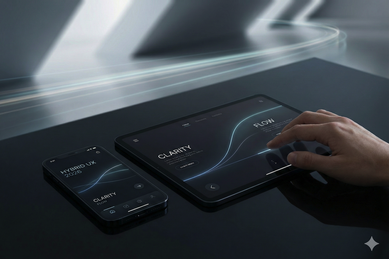
Featured Image generated by Google Gemini.
Share this post
Leave a comment
All comments are moderated. Spammy and bot submitted comments are deleted. Please submit the comments that are helpful to others, and we'll approve your comments. A comment that includes outbound link will only be approved if the content is relevant to the topic, and has some value to our readers.
Comments (0)
No comment