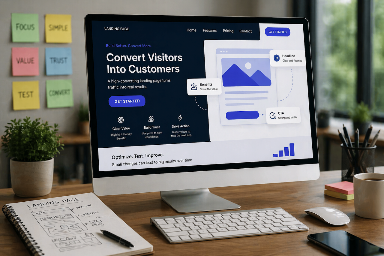
A landing page is more than just a digital entry point—it’s where visitors decide whether to take action or leave. No matter how much traffic you drive to your site, your results ultimately depend on how well your landing page converts. Optimizing this page is essential if you want to turn clicks into leads, subscribers, or paying customers.
Understand Your Audience
Before making any design or copy changes, it’s important to understand who your audience is and what they are looking for. As part of a broader digital marketing strategy, a landing page performs best when it speaks directly to a specific group rather than trying to appeal to everyone. When visitors feel like the message is tailored to their needs, they are far more likely to stay and engage.
Think about what problems your audience is trying to solve and what might be holding them back from taking action. When your content addresses these concerns clearly, it builds a stronger connection and increases the chances of conversion.
Write Headlines That Actually Matter
Your headline is often the first thing people notice, and it can make or break their decision to stay on the page. A vague or generic headline won’t hold attention for long. Instead, focus on clarity and relevance. Visitors should immediately understand what they’re getting and why it matters.
A strong headline highlights a benefit or outcome rather than simply describing a product or service. When people see something that directly relates to their goals or challenges, they are naturally more interested in reading further.
Keep Your Focus Narrow
One of the most common reasons landing pages fail is that they try to do too much at once. When there are too many options or distractions, visitors become unsure about what step to take next. A focused landing page, on the other hand, guides users toward a single action.
Keeping things simple doesn’t mean leaving out important information. It means presenting it in a way that supports one clear objective. When every element on the page serves that purpose, the overall experience becomes more effective.
Make Your Call-to-Action Feel Natural
A call to action should feel like a logical next step rather than a forced decision. When visitors clearly understand what they’ll get by clicking, they’re more likely to follow through. The wording should be simple and direct, while also emphasizing value.
Placement also matters. If your page is longer, repeating the call to action at natural points throughout the content makes it easier for users to act when they’re ready, rather than having to search for the next step.
Speed Can Make or Break Conversions
People have little patience for slow-loading pages. If your landing page takes too long to appear, many visitors will leave before even seeing your offer. This makes performance just as important as design.
Optimizing images, reducing unnecessary elements, and using reliable hosting can all improve load times. Even small speed improvements can lead to noticeable gains in engagement and conversions.
Use Visuals That Support Your Message
Images and videos should not just fill space; they should help communicate your message more effectively. When visuals clearly demonstrate how your product or service works, they make the page more engaging and easier to understand.
A well-placed image or short video can often explain something faster than text alone. This keeps visitors interested and helps them grasp the value of your offer more quickly.
Build Trust Gradually
Visitors rarely convert the moment they land on a page unless they already trust the brand. That’s why it’s important to include elements that build credibility as they scroll. Testimonials, reviews, or even simple proof of results can make a big difference.
When people see that others have had positive experiences, it reduces hesitation. Trust grows when your claims are supported by real examples rather than promises.
Keep the Design Clean and Easy to Follow
A cluttered layout can confuse visitors and distract them from the main goal. A clean design, on the other hand, makes it easier for users to focus on what matters. Spacing, alignment, and structure all play a role in guiding attention.
When your content is easy to scan, visitors can quickly find the information they need. This creates a smoother experience and keeps them moving toward the desired action.
Focus on Benefits, Not Just Features
It’s easy to talk about what your product does, but what really matters is how it helps the user. People are more interested in results than technical details. When your content highlights the outcome, it becomes more persuasive.
Instead of simply listing features, explain how those features improve the user’s situation. This shift in perspective makes your offer more relatable and appealing.
Simplify Forms to Increase Conversions
If your landing page includes a form, keeping it short can make a noticeable difference. Long or complicated forms often discourage users from completing them. The easier it is to fill out, the more likely people are to finish the process.
Asking only for essential information shows respect for the user’s time. It also reduces friction, which is one of the biggest barriers to conversion.
Test and Improve Over Time
Landing page optimization is not something you do once and forget about. What works for one audience or campaign may not work for another. That’s why testing different versions of your page is so valuable.
By experimenting with small changes, such as adjusting a headline or button text, you can learn what resonates most with your visitors. Over time, these improvements can add up to significantly better results.
Make Sure It Works on Mobile
With so many people browsing on their phones, a mobile-friendly landing page is essential. If your page doesn’t display properly on smaller screens, you risk losing a large portion of your audience.
A responsive design ensures that everything looks and functions smoothly, regardless of the device. When users have a seamless experience, they are more likely to stay and convert.
Encourage Action Without Pressure
Creating a sense of urgency can be effective, but it should feel genuine. When visitors believe they might miss out on something valuable, they are more likely to act sooner. However, this approach works best when it’s honest and not overused.
Subtle cues, such as limited-time offers or limited availability, can nudge users toward a decision without making them feel pressured. The goal is to guide, not force.
Final Thoughts
Improving your landing page is about making the experience as clear, smooth, and relevant as possible. When visitors understand your message, trust your offer, and feel comfortable taking action, conversions naturally increase.
Small refinements can lead to meaningful results over time. By focusing on clarity, simplicity, and user experience, you can turn more of your traffic into real outcomes.
Featured Image generated by ChatGPT.
Share this post
Author

Read the latest articles from Kylie Miler
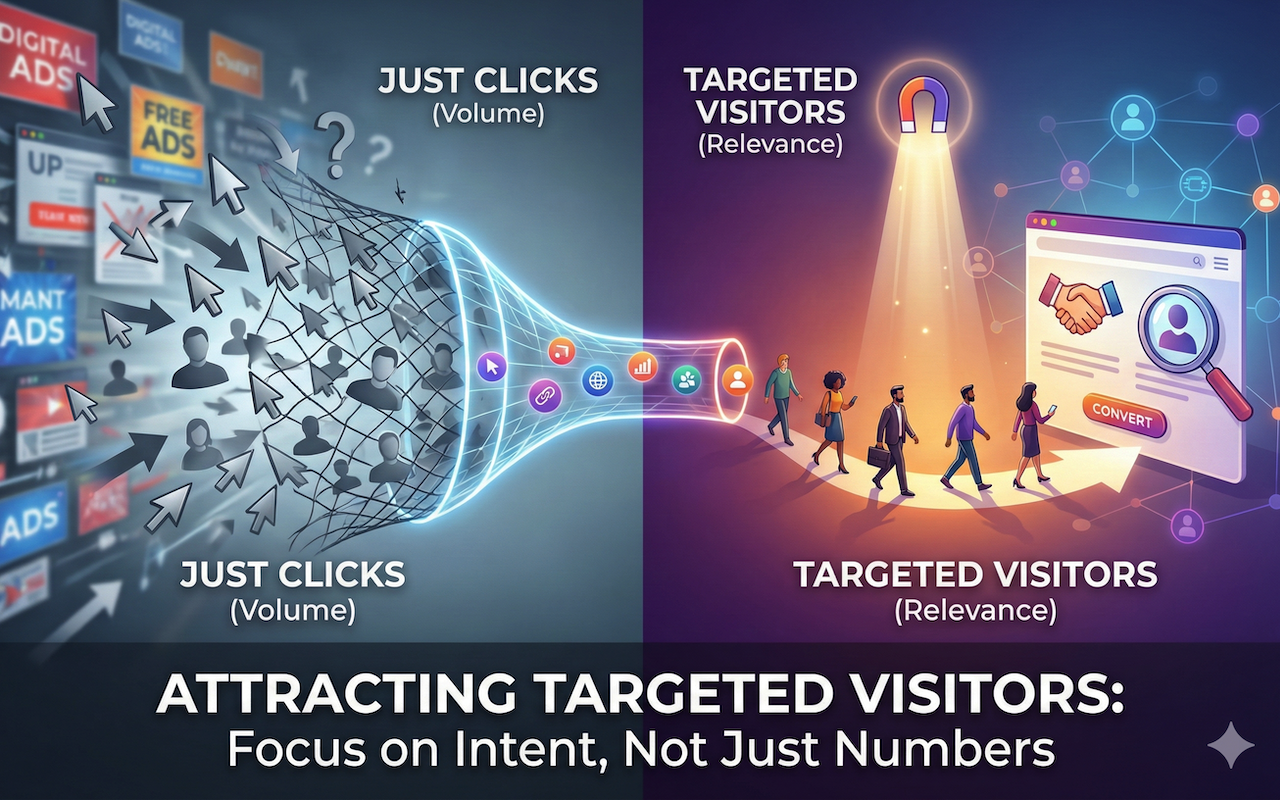
How to Attract Targeted Visitors (Not Just Clicks)
January 8, 2026
Driving traffic to a website is often treated as a numbers game. More clicks, more visitors, more impressions—surely that must lead to success. Yet many website owners, marketers, and entrepreneurs quickly discover a frustrating truth: traffic alone doesn’t guarantee results. If visitors aren’t genu [...]
Learn moreHow to Generate Targeted Website Traffic Without Paid Ads
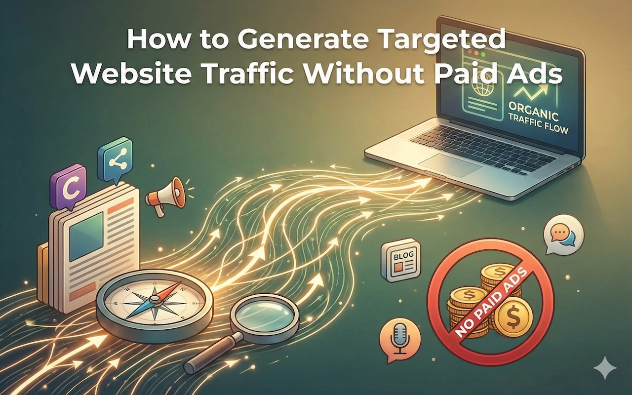
December 31, 2025
Generating website traffic is relatively easy today, but generating the right traffic is the real challenge. Targeted traffic consists of visitors who are genuinely interested in your content, product, or service and are more likely to engage, convert, or return. While paid advertising can accelerate results, it� [...]
Learn moreLeave a comment
All comments are moderated. Spammy and bot submitted comments are deleted. Please submit the comments that are helpful to others, and we'll approve your comments. A comment that includes outbound link will only be approved if the content is relevant to the topic, and has some value to our readers.
Comments (0)
No comment