The web design world has been an arena of warring philosophies. Over the past ten years, minimalism was the order of the day - straight lines, space, the gospel of less is more, permeated the pages of all design conferences and agency books. However, something has changed. Look through the highly discussed websites of 2024 and 2025, and you will see more daring decisions infiltrating back in: the combination of clashing colors, dense structures, expressive typography, and visual anarchy will somehow make sense. What then is the fate of designers today? Is minimalism dead, or is it simply a screaming fad to be left behind? The solution, as to most matters in design, is far softer than either camp will be ready to acknowledge.
The Two Philosophies in a Nutshell
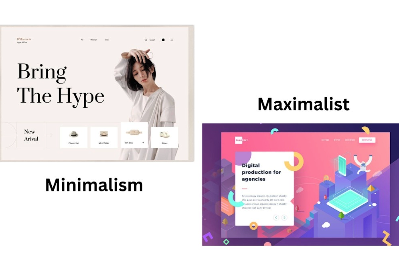
The concept of minimalism in web design is based on the idea that each element on a page must justify its existence. It is based on the Bauhaus movement and the well-known Dieter Rams philosophy: less, but better. In real life, it translates into ample white space, a minimalist color scheme, pure sans-serif fonts, and a strong visual hierarchy that does not distract the user. Consider the Apple webpage, or the landing pages of Stripe, or nearly any other SaaS product of the day. The interface is removed, and the content is placed at the forefront.
On the other hand, maximalism endorses extravagance. It superimposes textures, patterns, colors, and type with planned intensity. It is loud, unapologetic, and usually theatrical. Good maximalism is extremely controlled rather than sloppy. It is not to eradicate the visual noise but to compose it into something unforgettable and overwhelming. Maximalism has become the core of the digital presence of brands such as Gucci and Diesel, as well as a rising generation of independent creative studios.
Why Minimalism Reigned so Long
The reign of minimalism was not accidental. It was successful in the mobile-first era, when screen real estate was valuable and load times were paramount. Flat design, aggressively launched by both Apple and Google in 2013, removed skeuomorphism and decoration in favor of clarity and performance. The outcome was a faster, cleaner, and easier-to-navigate internet on a four-inch screen.
Minimalism had its business rationale, too. The literature on the optimization of conversion rates presented a consistent finding that visual clutter (fewer buttons, distractions, and more focused calls to action) lowered user behavior measures. When users were required to make fewer clicks and fewer bounces under minimalism, the business case was airtight.
However, the effect minimalism had on the world also came with an unintended side effect: everything began to look alike. The same hero section with a headline on the left and an illustration on the right. The identical navigation bar. The same muted background, teal accents, and bold typography, often styled using tools like a bold text generator, on an off-white canvas. Design became predictable, and predictable design ceased to be memorable.
The Maximalist Comeback
The homogeneous design argument has been on the offensive. Younger brands, especially in fashion, music, food, and culture, began to consciously abandon the clean aesthetic because it no longer conveys anything distinctive. When all the startups are similar to each other, none of them is unique.
Maximalism returned not only as a style but also as a strategy. In the saturated digital world, the design that prevents scrolling is the best. Crowded, stacked, aesthetically violent pages do just that. They not only provide information, but they also experience it.
The Y2K aesthetic resurgence helped as well. The nostalgia for the messy, colorscams, oversaturation so characteristic of the early 2000s, the bitmapped textures, visible grids, the brutalist typography provided maximalism with a cultural point of reference that younger audiences were used to seeing, ironically, reused on social media.
What Actually Works Today
The simple truth is this: pure minimalism or pure maximalism can be no more generally a solution. This is all about context: the personality of the brand, the audience it is aimed at, the platform, and the emotional reaction it is attempting to evoke.
Minimalism continues to triumph when clarity, trust, and conversion are in view. Friction is greatly reduced in healthcare platforms, financial services, enterprise software, and e-commerce checkouts. Visual noise is the adversary when the user must make fast and confident decisions. It has a soothing, open interface that conveys trust. It reads: We are not hiding anything, and everything is in control.
Maximalism justifies itself when identity, emotion, and memorability are desired. The metrics of success for a fashion brand, an artist's portfolio, a music label, or a cultural institution are not comparable to those of a SaaS product. When what you do is build desire, get a feeling, or just be memorable, then restraint can be your worst enemy. The user is made aware of something important about the brand, even before they have read a single word, by a bold, visually aggressive site.
The most interesting work in the present is the one in the middle. The trend is toward what some refer to as expressive minimalism on the part of designers, where the structure is clean, with visual drama sprinkled throughout. One huge, startling typeface on a white background. A mere grid, which abruptly tears. Minor interactions that are oddly playful. It is a hybrid solution that remains usable while adding personality, and it is arguably the most advanced stance a designer can assume at the moment.
The Motion and Interactivity Role
Motion design is one of the dimensions that both philosophies have been forced to grapple with. Scroll-triggered effects, cursor effects, and parallax effects have also become potent tools, tools that determine which camp a designer belongs to. Even a plain site can be rich and alive with a careful use of motion without incorporating any additional functionality. Animation can help a maximalist site to provide the eye with a route through visual complexity.
The most important one is intentionality. Motion that is useful to the experience - showing content, guiding focus, generating pleasure - takes any design philosophy to the next level. Any motion meant to flaunt development prowess is bound to frustrate users, regardless of how shiny it is.
What Designers really ought to be asking
When you rephrase the major question, the minimalism vs. maximalism debate is a lot less helpful. Rather than posing the question: how much should I put on this page, what is needed is: What does this brand need to communicate, and the best way to communicate it?
There are occasions when that response is blankness and silence. Occasionally, it is color and disorder. It is often a finely tuned balance between the two, not too much restraint to be maneuvered, not too much personality to be forgotten.
The most interesting work that the designers are doing is not devoted to either camp. They speak both of them, and they are making a choice.
Final Thoughts
Minimalism itself is not dead; it is just not the default anymore. Maximalism is not a fad; it is a valid design language with a long history and a strategic rationale. Both make the web design space in 2025 richer.
The best designers know that there is a reason there are rules to be learned before they can be broken. The reason why minimalism is effective is to understand when it is not the appropriate tool. And you require actual visual intelligence to peel off maximalism without falling apart into a mess. Minimalism or maximalism was never the object; rather, it was communication. All other things are merely instruments to that.
Featured Image generated by ChatGPT.
Share this post
Author

Read the latest articles from Aiyla Eylül
The Impact of Cloud Technology on Modern Web Applications

June 2, 2026
The internet has evolved dramatically over the past decade. Applications that once ran on physical servers in corporate basements now operate across vast networks of distributed infrastructure. Cloud technology has been one of the key forces behind this transformation, influencing how modern web applicati [...]
Learn moreEmerging Technology Trends Transforming the Digital World

June 2, 2026
Ten years ago, many of today’s technologies would have seemed like science fiction. Now, everything from wrist-worn computers to vehicles with advanced autonomous capabilities has become part of everyday life. Yet the pace of innovation continues to accelerate. The convergence of several major technology trends [...]
Learn moreLeave a comment
All comments are moderated. Spammy and bot submitted comments are deleted. Please submit the comments that are helpful to others, and we'll approve your comments. A comment that includes outbound link will only be approved if the content is relevant to the topic, and has some value to our readers.
Comments (0)
No comment